1.40.0 - Rapid Platform

10/05/2024
Features
Unification of Attachments and Embedded files components
Prior to this release (v1.40), Rapid Platform has two components which the users could use to attach files against table items. These components were:
- Embedded Files
- Attachments
Attachments and Embedded Files have always occupied a similar space. Frequently we have been asked about the difference between them and when to use either. With this new release both approaches have been collapsed into a singular Attachments system to make managing files on items simple.
Although, both the components principally served the same functionality of attaching files against items; however, there were finer differences in functionalities offered by the two components.
Post release v1.40, all the functionalities of Embedded Files and Attachments are merged together under the title Attachments.
Under Attachments, we now have:
- Attachment File Bar (the parallel to Embedded files)
- Attachments component
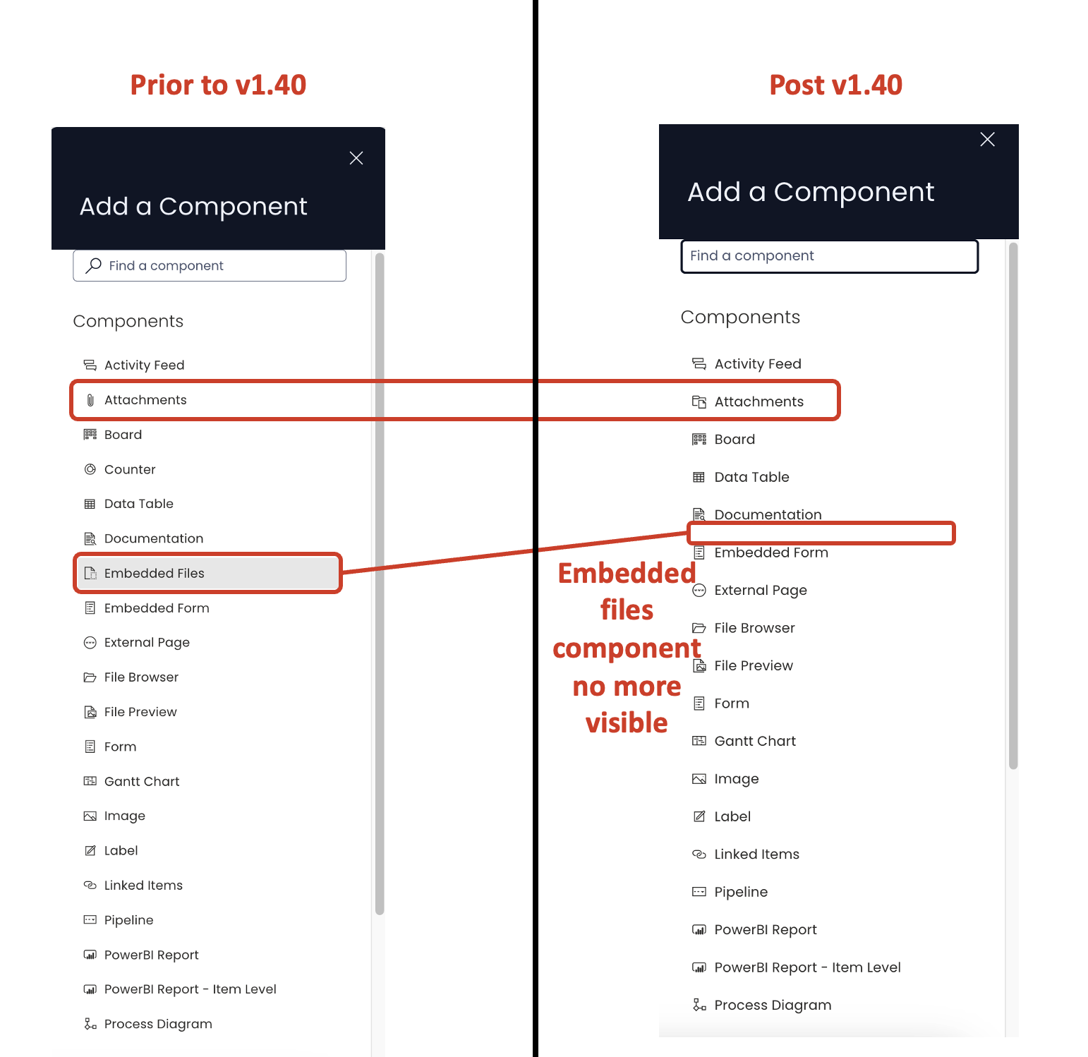
Attachments in Designer
No more Embedded Files component in Designer
The Embedded Files component can no more be seen in the Components list. The Attachments component can be added, as normal.
The Attachments component added from the "Add a component" panel displays the list of attached files in Explorer. This may not be visible to the users in Explorer, if there are no files attached.
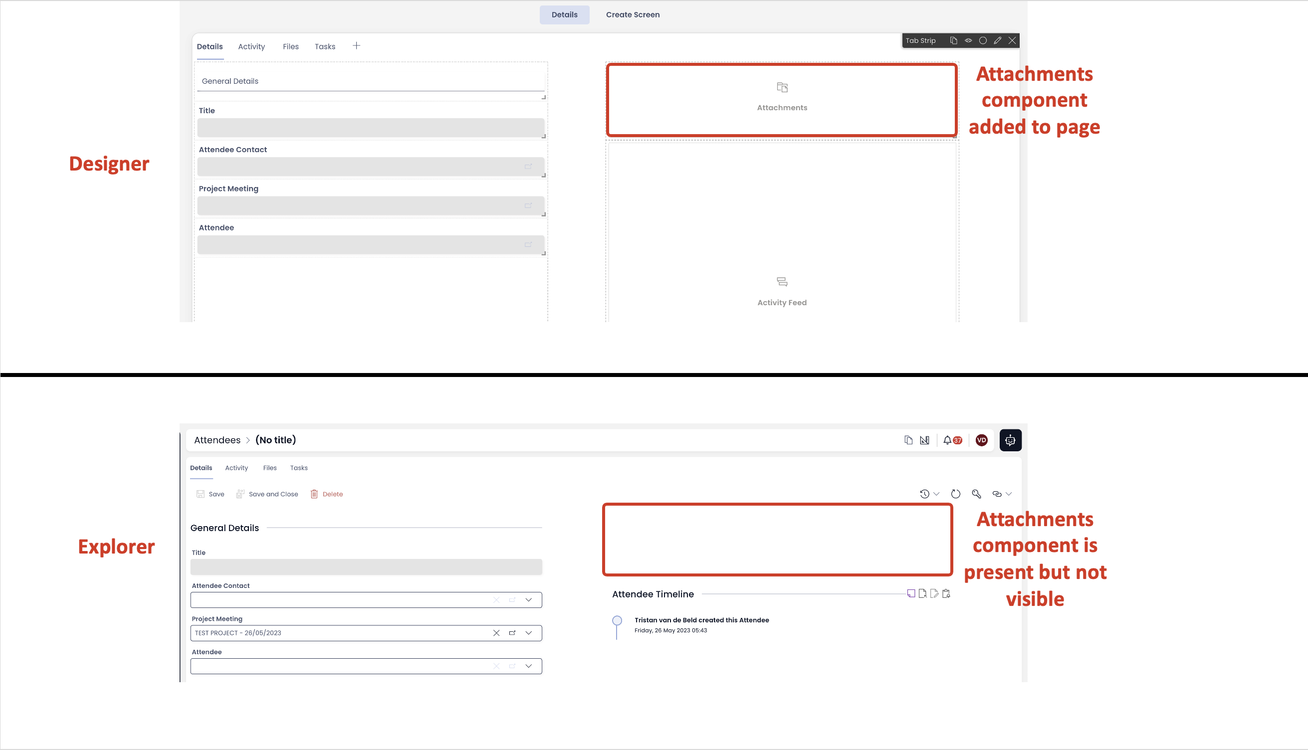
The users in Explorer cannot add files to the Attachments component until the Attachment File bar is enabled from the Tab Strip and the first file is uploaded there.
Enabling the Attachment File bar
To provide the ability to upload files in Explorer, you need to enable the Attachment File bar from Tab Strip.
Please consider the following steps:
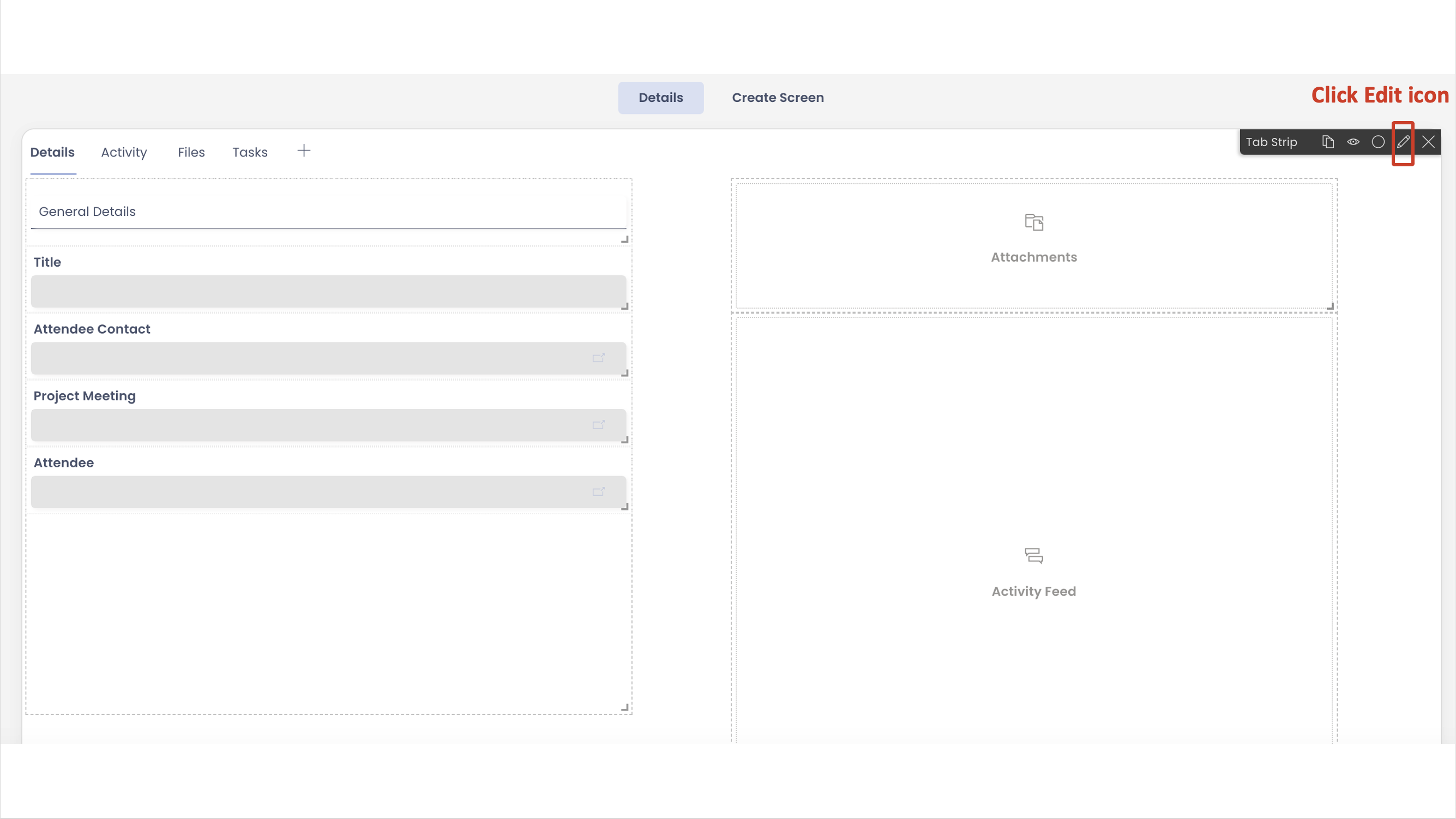
- Navigate to Designer of your desired Table.
- Goto Design Tab and select Singular (Item level) set of pages
- On the Tab Strip, click the Edit icon.
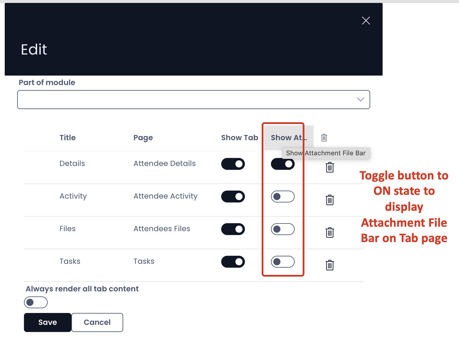
- The Tab Strip Edit panel will open showing the list of all the tabs. Toggle the "Show Attachment File bar" button for the tabs where you want to provide the users with ability to access Attachments.
Attachments in Explorer
Adding files
When the Attachment File bar is enabled for the tab, the user can see an "upload" icon at the top left corner of the tab page.
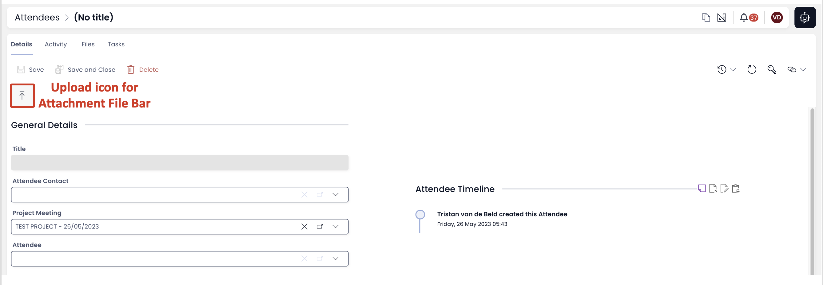
The user can click the icon and the upload the desired file from a directory location.
OR
The user can also drag and drop the file(s) at the icon.
As soon as the file is dropped at the icon, it gets uploaded as attachment to the subject item.
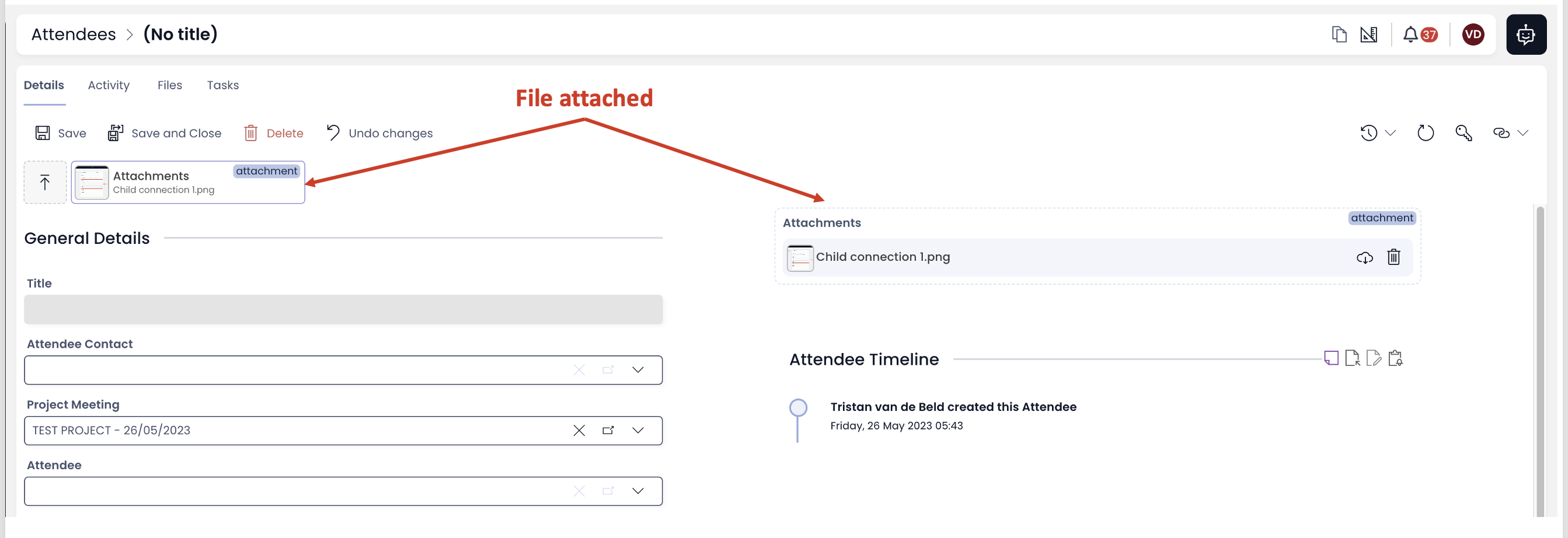
If the Attachments component is added to the page in Designer, then it will show the list of attached files in Explorer.
If there is an Attachments component added to the page AND the user have added the first file to the Attachment File Bar, THEN the user can add more attachments by drag and drop to the Attachments component as well.
You can select multiple files and upload them simultaneously.
Appearance and features of Attachments in Explorer
The Embedded Files appearance and features are available in the Attachment File bar.
Attachment File Bar
-
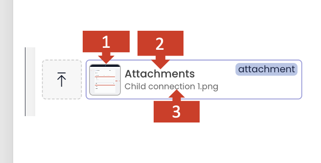
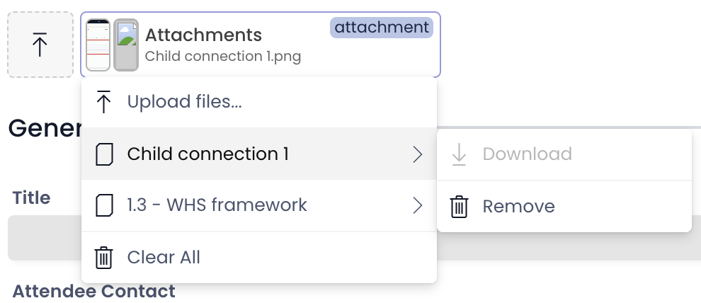
As soon as the first file is attached, a rectangle titled "Attachments" appears (Attachment File bar).
-
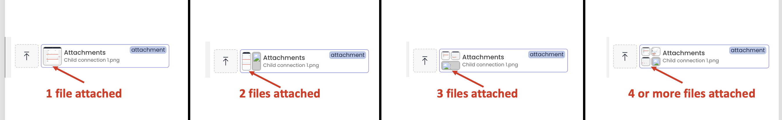
A small image identifier of the file displays at the left of the Attachment file bar, if the uploaded file is of an image type. This identifier also indicates the count of the files attached through this pattern. If the file count exceeds 4, the pattern shows first four images.
- The name of the file attached is displayed.
If there are more than one files attached, then the name of the first file in the stack is displayed.
Features
As the user clicks on the Attachment File bar rectangle, a list of all the files attached appears.
- More files can be uploaded.
- Individual files can be downloaded / removed.
- All files can be removed.
The Attachments component appearance and features are retained in the Attachments component.
Attachments component
The appearance and features of Attachments component are retained.
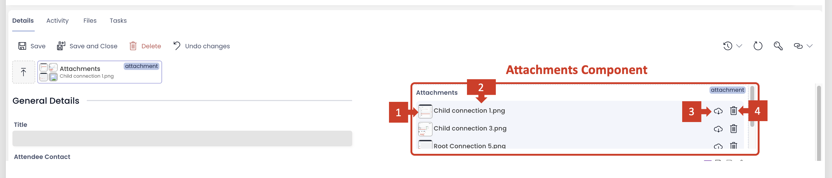
- File identifier image
- File name
- Download file
- Remove file
Relationship with Files Browser component
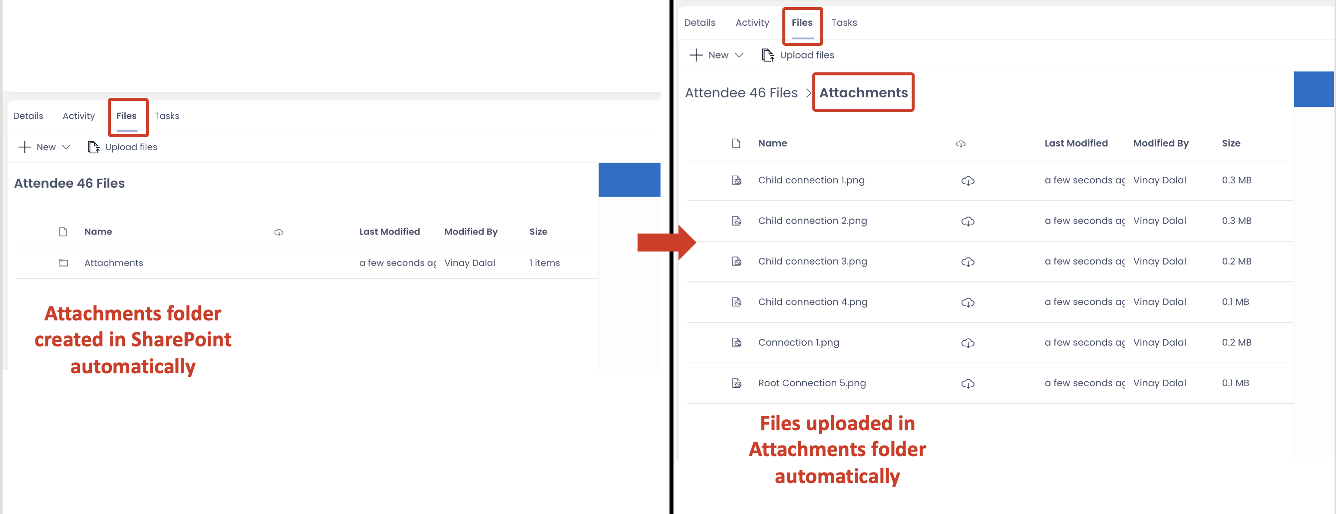
As soon as the first file is added as attachment to the item, an "Attachments" folder is created in the defined SharePoint directory of the item.
This can be accessed through the Files Browser in the Files Tab of the Item.
The "Attachments" folder will have all the files uploaded to the SharePoint automatically.
All the features and functionality of Embedded Files and Attachments is retained and unified as "Attachments".
The all new Visualisation Component
This release introduces the cool 2D chart visualisation component.
Imagine a Project Manager trying to analyse the distribution of project tasks statuses (completed, in-progress and pending for start) from table data. It would be with a simple pie chart. Isn't it!
OR
Imagine yourself as a finance manager, trying to crunch numbers analysing changes in pattern of average asset values for a particular type of asset across the last two financial years. A bar graph can be such a life saver!
This new visualisation component makes the assimilation of data easier, without the need to navigate off the table page (to load a specific Power Bi report).
How to add the visualisation component?
To add a visualisation component, please consider the following steps:
- Navigate to your desired table in Designer.
- Goto the Design tab and select the page where you want to add the visualisation.
- Open the Add a Component panel on the layout / page by clicking the + icon.
- In the Add a Component, observe the section - Visualisation.
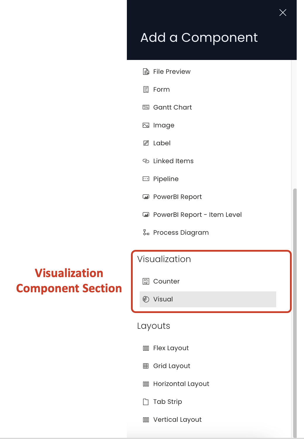
- Click Visual to add the component to the layout / page.
The visualisation section, at present, as two components
a. Counter component
b. Visual component
The Counter is an existing component, however, the Visual component has a capability to configure a counter and with a greater capacity to express data (discussed later in this article).
We will discuss the Visual component in this article.
If you are adding a visual component to the list page, it is a good practice to first add a Tab Strip and then add Visual component to a separate tab. This way the user can view the list and the visualisation based on specific need.
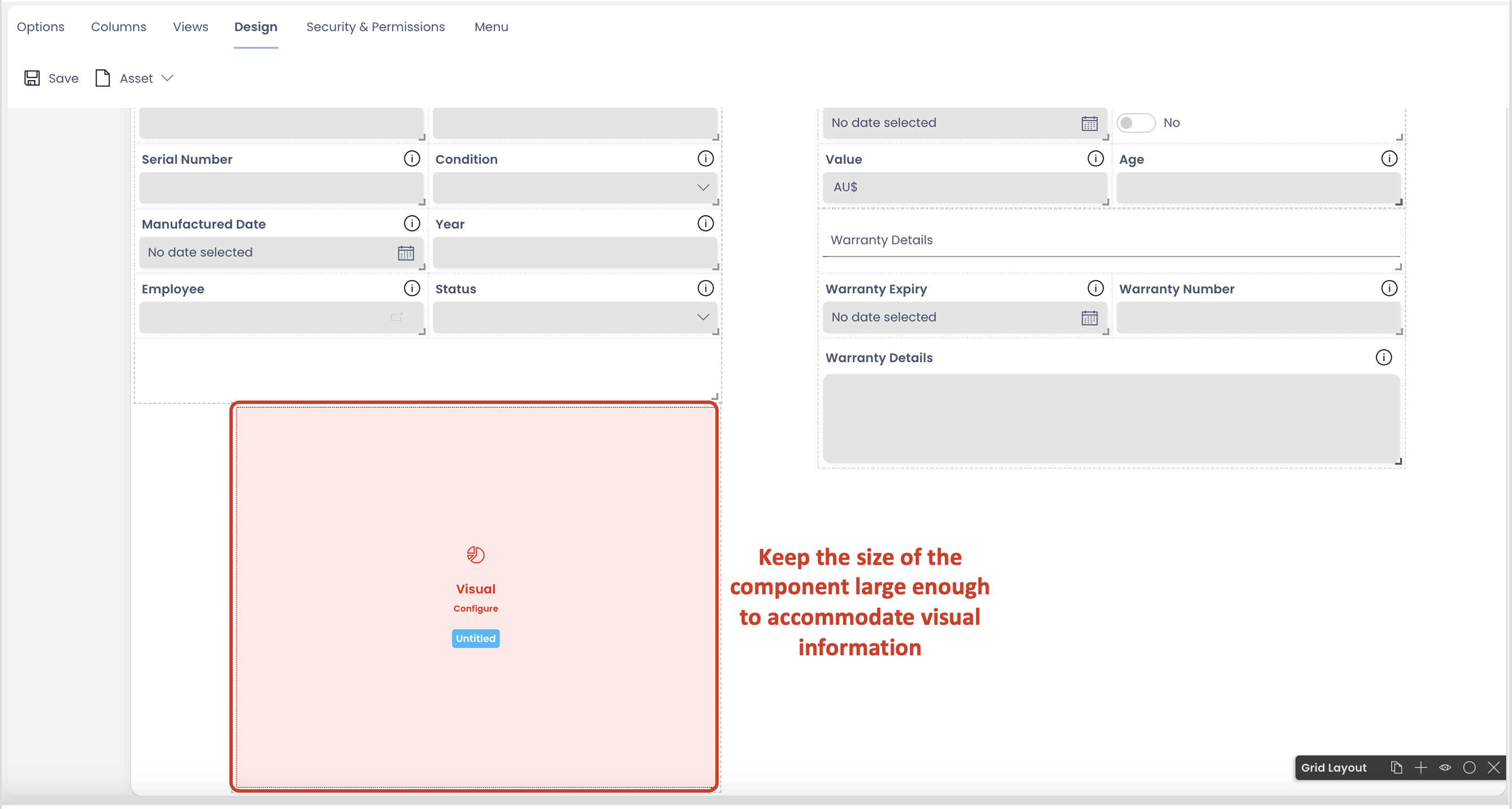
If adding the Visual component on a page along with other components, it is important that the width and height of the component is kept large enough, so as to accommodate visual information properly.
Configuring the Visual component
To configure this component, please consider the following points:
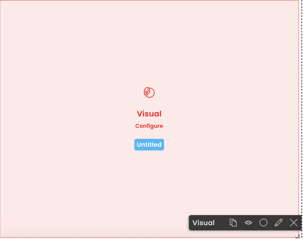
- Once the component is added to the page, it appears in Red colour. This indicates that the component is not configured correctly yet.
-
Click on the edit (pencil) icon.
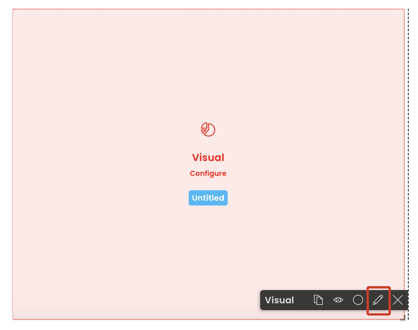 A panel to edit component preferences open up.
 -
Configure the component.
Following is the description of each field of the Visual component Edit preferences panel.
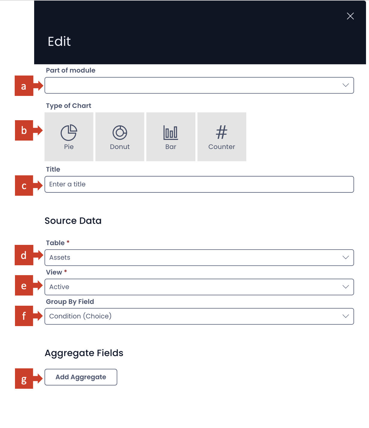
a. Part of module - This is a dropdown field. It has the list of all the modules available for your site. If your component belongs to a specific module, you can select the same in this field.
b. Type of chart - Here you can select the nature of chart in which you want to display information.
There are four options available at present:
i. Pie
ii. Donut
iii. Bar
iv. Counter
Please note, you can select only one of the types. Although this field is not mandatory at present, you need to select a type to meaningfully configure the component.
c. Title - This is the title of your chart. It appears on the component in Designer and above the chart in Explorer. Although this field is not mandatory, however, it is a good practice to provide an appropriate title to your chart, so that it assists everyone in interpreting the information better.
Next is the Source Data section.
d. Table - This is a dropdown field. Clicking on this field will open a list of all tables present in the site. Select your desired table from this list. Please note this is a mandatory field.
e. View - Based on the Table selected, all the eligible Views appear in this dropdown list. Select the View of your choice here. The name of the selected View will also appear on your component in Designer.
Every 2D chart is based on a minimum of two variables.
First is the independent variable. The independent variable defines the group or category for which the chart is plotted.
The second is the dependent variable. It defines what value to plot for each state of independent variable (ie. each group or category).
For example - A chart can be plotted to depict average $ value of all assets by asset condition. Here, condition of asset is independent variable which defines the group or category. Condition can be Excellent, Good, Fair or Not Working.
The chart will plot dependent variable - average $ value - for each state of independent variable ie. of each group or category.
f. Group By Field - Here you can define independent variable - the group or category for which the value needs to be plotted. This is a dropdown field. Clicking on this field will open up the list of all the columns of the selected table (except those of Multi-lookup type). The column title appears with its type mentioned in brackets. Click your desired table column as independent variable.
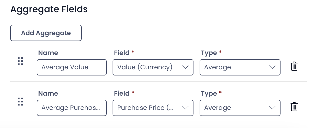
Aggregate Fields section
g. Add Aggregate button - Click this button to add the dependent variable. As you click this button a set of three fields will appear in this section.
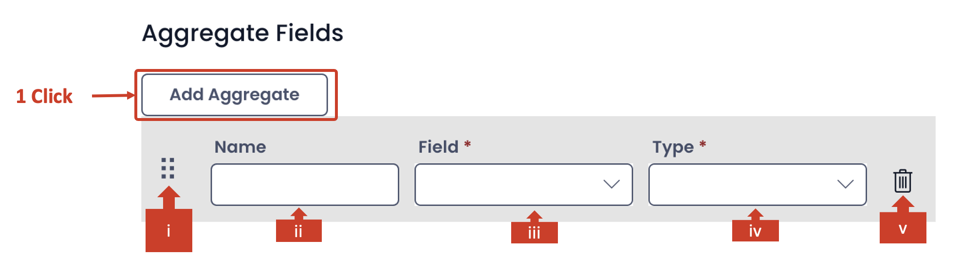
The aggregate section allows you define the dependent variable for the chart.
It is important to note that you need to define at least one dependent variable for all chart types.
However, you can define more dependent variables for Bar chart and Counter types.
Pie and Donut chart work with only one dependent variable.
With every click on Add Aggregate button, a new set of fields will appear, allowing you to configure more dependent variables.
Please consider the below description of fields for aggregate (dependent) variable.
i. In case when there are multiple aggregates (dependent) variables defined, this allows you to arrange the variables in correct order. By click and drag on this icon you can reorder the variables up and down in the list of multiple aggregate variables.
ii. Name - You can type the name of the aggregate (dependent) variable here. It appears in the chart in Explorer.
iii. Field - This is a dropdown field. As you click on this field a list of all columns of the table (as selected in d. above) will appear. Again, the multi-lookup types do not feature in this list. You can select the desired column as your dependent variable. Please note this is a mandatory field.
iv. Type - The type field provides the function operator based on which the value of the selected aggregate variable is calibrated. This is a dropdown field. There can be six options:
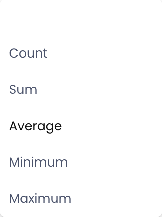
The option names are self-explanatory of their meaning.
If you select the blank as a value for this type, the aggregate variable will become ineffective and will not appear in the chart.
This is a mandatory field and needs to have a non-blank value.
v. Bin - Click on the bin icon to delete the aggregate variable.
You can configure multiple aggregates.
4 . Save the page for the configuration to take effect.
How does a successfully configured visual component appear in Designer?
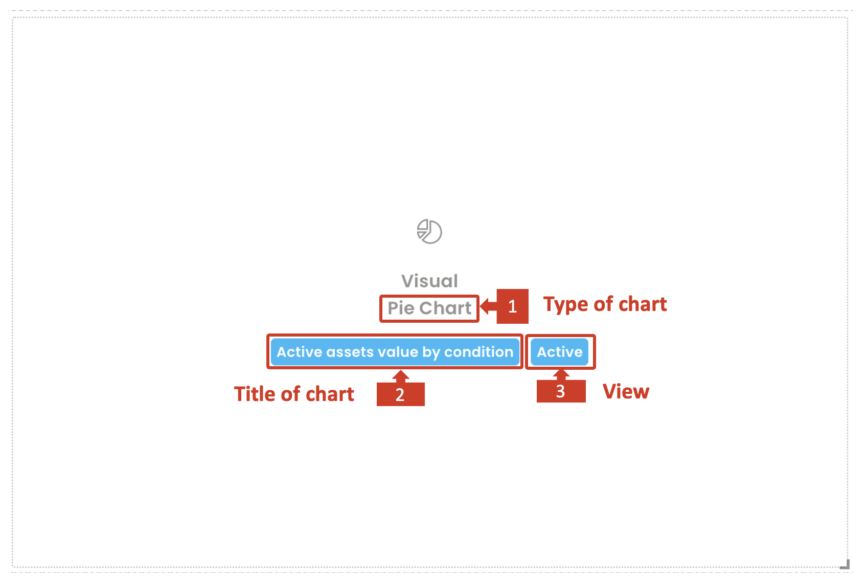
A successfully configured component appears white, while a component not configured properly shall appear in red background.
It provides the following information.
- The type of chart selected
- Title of the chart
- View of the table selected
Sample of charts with one aggregate variable
| Pie chart | Donut chart |
|---|---|
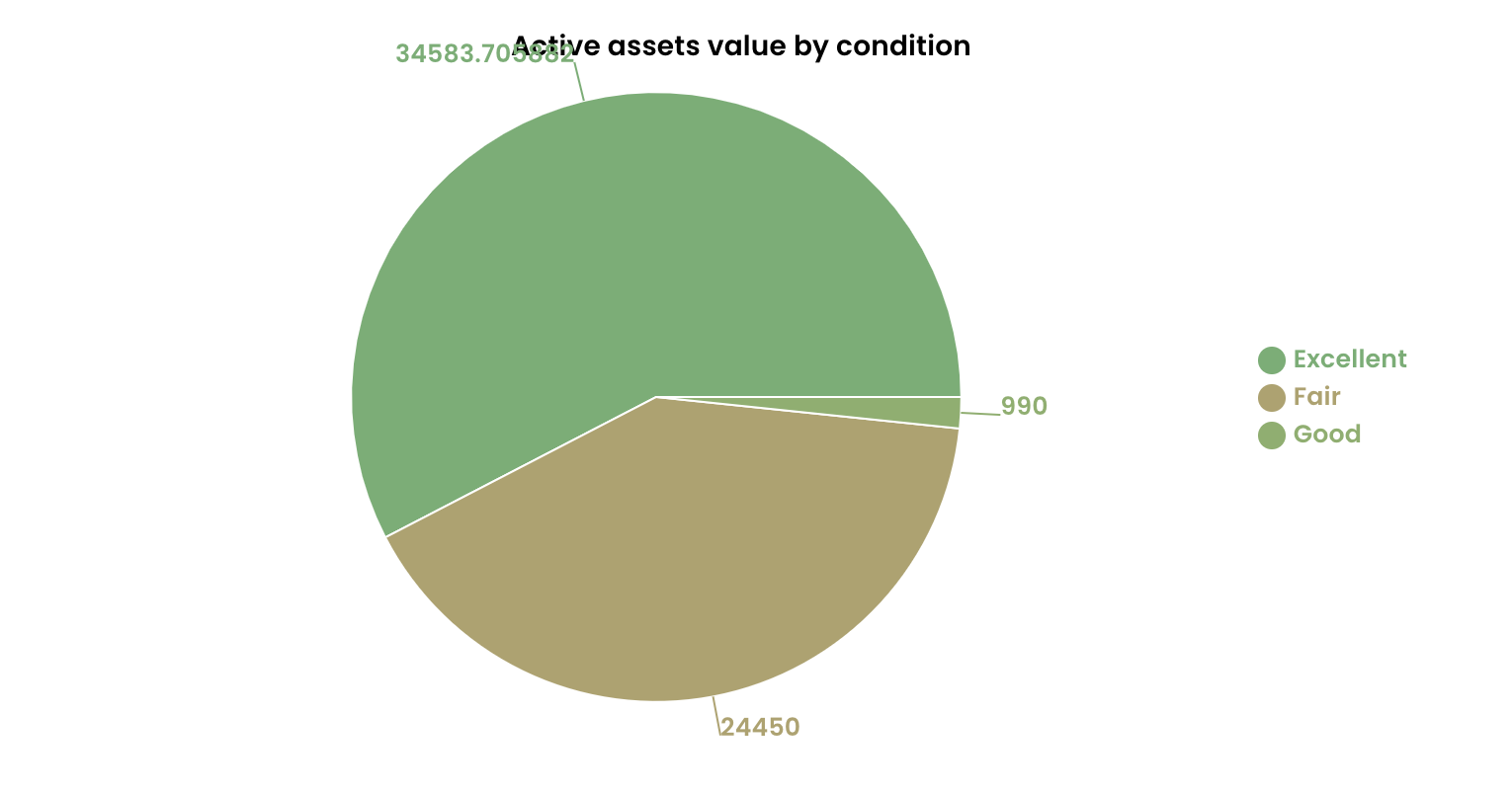 | 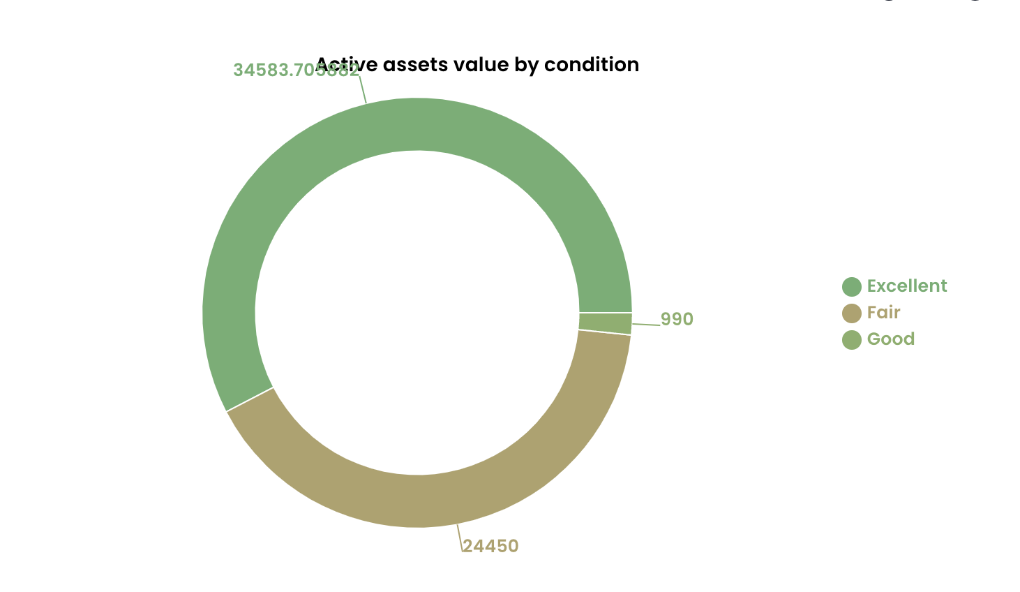 |
| Bar chart | Counter |
|---|---|
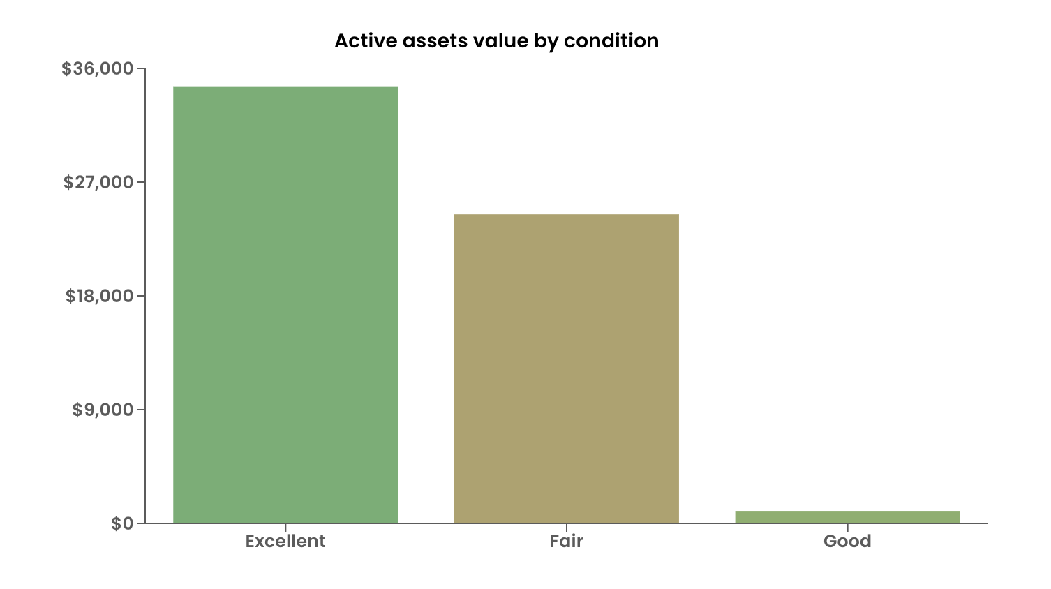 | 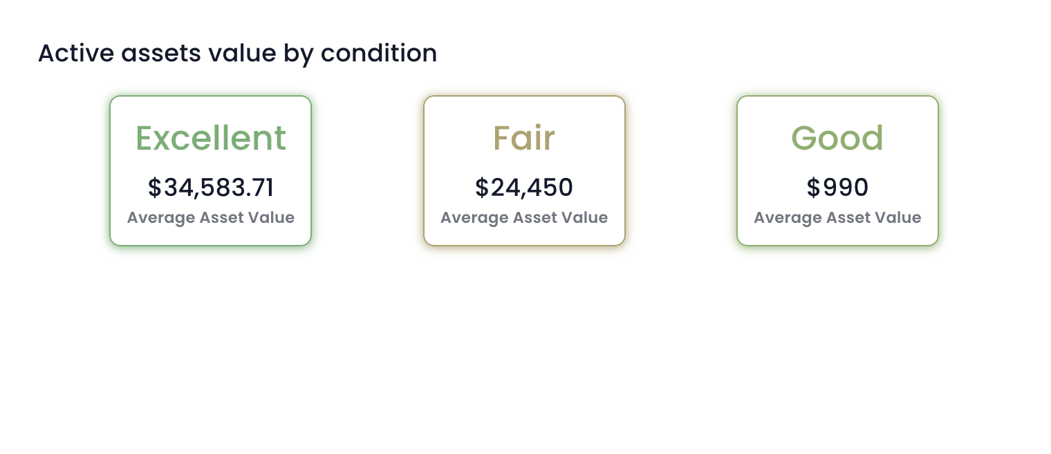 |
Sample of charts with two aggregate variables
| Bar chart | Counter |
|---|---|
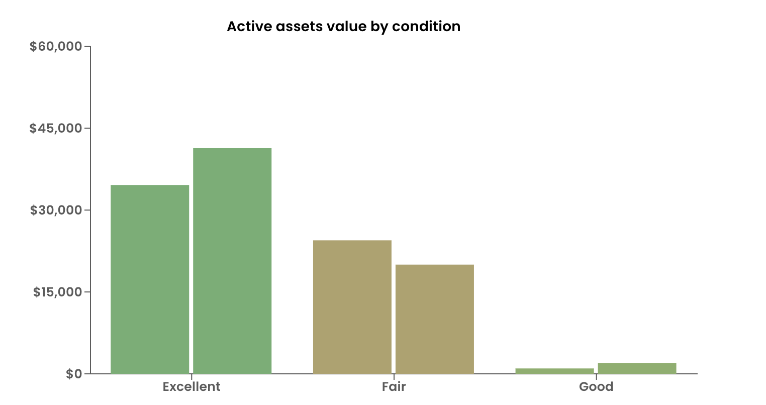 | 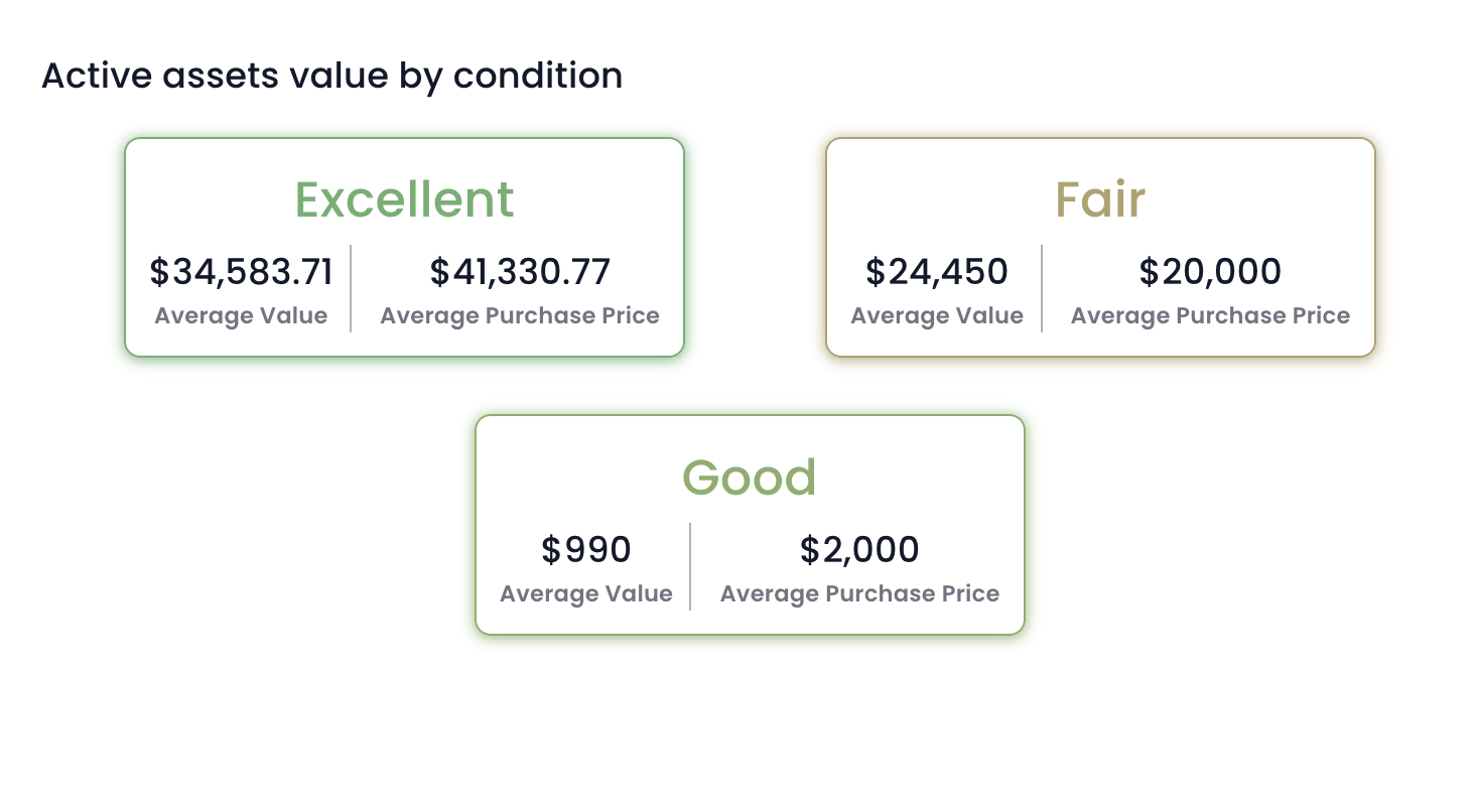 |
It is important that the choices of variables and configuration are meaningful. For example - if you select a Single line of text type of aggregate variable and ask the system to calibrate its average, then such a combination does not return any meaningful value.
In such cases, the component will break and it will not load / render on the Explorer page.
Improvements
- Improved adaptive condition expressions to handle nested connections
- Improved adaptive validation expressions to handle nested connections
- Increased the size of the expanded multi-line text fields in explorer
- Added default date configuration for date fields
- Improved validation message presentation to not be so sticky
- Added Required star configuration support to Date and Choice adaptive inputs
- Added the connection for elements when picking an element through v3 Designer
- Single line of Text columns can now define their character limit (default 512)
- Workflow signal
changed()function can now respect missing columns
Bug Fixes
- Enabled configuration on file upload component in Adaptive v3
- Prevented Explorer documentation component from overflowing text
- Updated
htmlToText()lodash function to not insert extra line breaks - Deleting a connection in v3 Designer no longer deletes unrelated connections
- Prevented page crash on sign-up experience when the user has a fresh tenant
- Default value configuration on v3 Adaptive elements are now respected
- Fixed v3 rich text components being stuck in upper case
- Enabled menu permissions to apply to nested menu items
- Fixed public forms embedded files failing to respect the filename and drive configuration
- Updating a title via workflow no longer skips keeping SharePoint folders in sync
- Updating sub-type items will now keep their SharePoint folder in sync